|
In June of 2015, Nobel laureate Tim Hunt gave a speech at the World Conference for Science Journalists in Seoul, South Korea, to a luncheon of female scientists. Part of the speech is recounted as follows: It's strange that such a chauvinist monster like me has been asked to speak to women scientists. Let me tell you about my trouble with girls. Three things happen when they are in the lab: you fall in love with them, they fall in love with you, and when you criticise them they cry. Perhaps we should make separate labs for boys and girls? Now, seriously, I'm impressed by the economic development of Korea. And women scientists played, without doubt an important role in it. Science needs women, and you should do science, despite all the obstacles, and despite monsters like me. An attendee of the luncheon, outraged by his remarks, publicized them on Twitter, creating a lot of backlash against Hunt. In his words, Hunt intended his speech to be a joke, which he thought he’d made clear enough by the inclusion of the words, “Now, seriously,” but his intentions didn’t come through in the way he’d hoped. Soon afterward, under fire from social media, Hunt resigned from his position as honorary professor at University College London and gave up his place on the Royal Society’s Biological Sciences Awards Committee. According to a student’s statement to his wife, if he hadn’t resigned, he would’ve been fired. How did this happen? 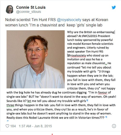
0 Comments
  The above images are my designs for our class's portion of the Nashville Shakespeare Archive. I spent far too long on them because I don't understand the Adobe Suite, let alone Macs as a concept. I am in agony as I type this. Please free me.
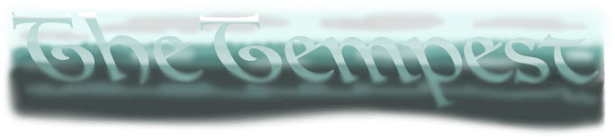
Anyways, I based my Tempest logo off of the title itself: a tempest. The storm is the play's inciting event, so I put a lot of importance in capturing the stormy feel of it in my logo. Additionally, though the play is more whimsical than serious, it is a complicated story that treads the line between forgiveness and revenge. The turbulent waters and the blurring effect lend themselves to that aspect. I believe that people with no real knowledge of the play can still appreciate my logo purely because they have no foreknowledge; the title is a storm, so it stands to reason that the logo would resemble one. Those who know a bit more about the play's plot will appreciate my nod to the denotation of the title, and perhaps even read into my other design choices. The webpage design follows that idea pretty closely. For one, I love the cyan-esque color scheme I settled on, so looking at it makes me feel good. For another, I used many of the same colors, but made sure the logo would be visible on the background. I drew inspiration from the Antony and Cleopatra portion of the Archive, in which the navbar was located at the top of the screen and the logo in the center as the main focal point. I love a good blocky navbar, so that was a no-brainer. I also think that setting the links against a darker background in order to make them stand out helps with general accessibility; visitors can't click our links if they can't see them. Much like the logo, the webpage design has a sort of gradient going on to look more like water. I ordered it darkest to lightest in this case for visibility's sake. Again, the fuzziness of the colors parallels the moral fuzziness of the play: will Prospero enact complete revenge, or will he forgive his tormentors? The navbar items are as centered as they can be and span the whole screen, making them immediately visible to any viewer. I used the order we agreed upon in class, which makes the most sense in my head. I'm not married to the font I chose, but regardless, I wanted something blockier yet a little funky to capture the play's whimsical tendency while still remaining legible. The worst thing is when a website is written totally in script fonts and you can't tell what you're supposed to be clicking on when you're clicking on it. It's important to me that anyone visiting knows where they're going. I'm not sure what else to say about all this, but I definitely had more fun coding a whole webpage. Oh well, I'm finally finished and hopefully won't be assigned to Photoshop projects in the future. I love you all. Hey, I made a video! Y'all should check it out. I think it's really brilliant. Storyboards for a digital literacy project! Obviously, I am not an artist. Not even a little bit. Please be nice to me. 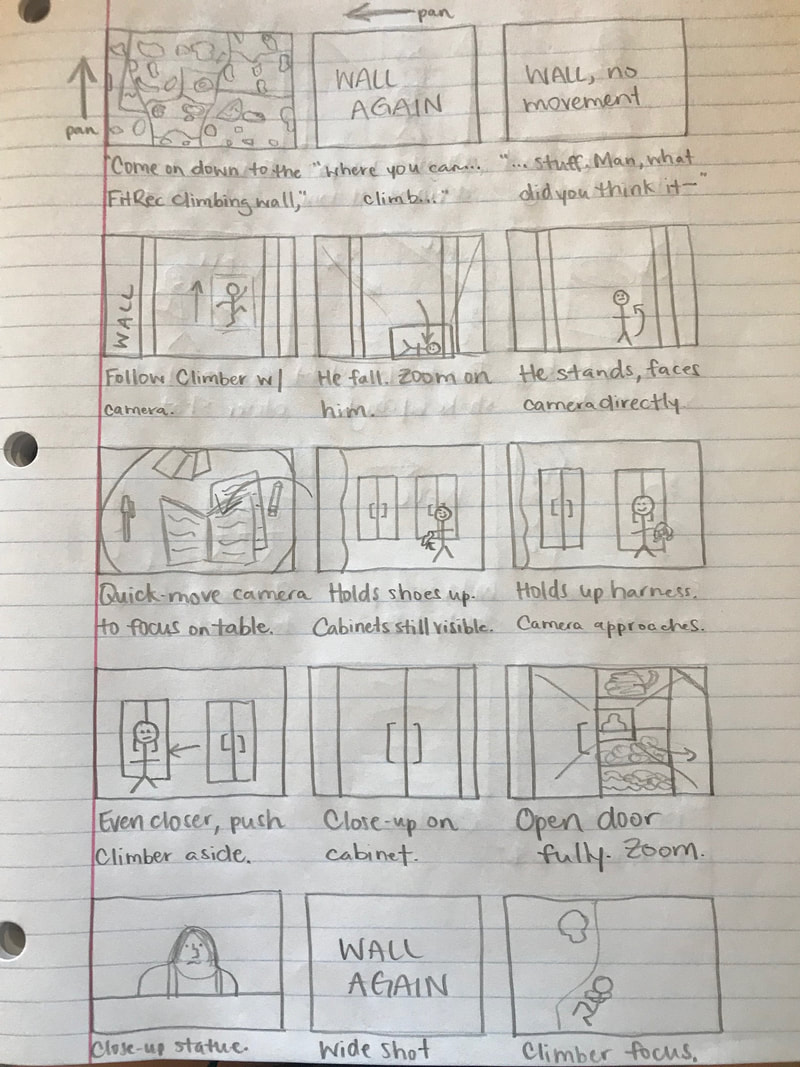 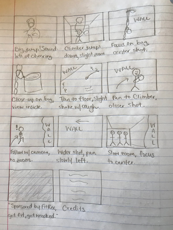 
I made a website! Isn’t that neat? Somehow, it was both harder and easier than I thought it would be. From the technical side, a lot of it was fairly similar to the HTML tutorial. I made a handful of pages and linked them all together. I started with a green for the page headers that I liked a lot, and when I got the idea to make the website icon a hibiscus, the rest of the color scheme came together. I have no other justifications for that other than it’s my website and the colors make me happy.
For the top nav bar, I browsed the Listamatic website for a while until I hit something I liked the look of. Most of the code was copied directly over, with minor changes in the div names so I could remember which code went to what. Once I figured out that I could make the boxes change color when someone moused over them, I leaned into that full force—one, because it made the website look really nice, and two, because I figured it would make for easier accessibility. Anyone visiting my website would be able to see exactly which button they were about to click because it would stand out from the others. Initially, I pictured a nav bar oriented to the left, but the center-aligned one I settled on looks a lot more balanced, I think. Let’s talk about the challenges! I wanted to tear my hair out multiple times during this project because my images just wouldn’t show up where I wanted them to be. I had the most trouble with this on the About page because I was working with so many different aspects at once. Foolishly, I set up the page in its entirety, pictures and text, and then decided that I wanted to add the “What I’m Up To” list on the side. Reformatting that was a nightmare, but I eventually hit something I was happy with. The code for that list was also taken from Listamatic, and I used a similar technique for making the buttons change color when you hover over them. I didn’t think much about the design strategies in concrete terms. Like, logically, I knew to incorporate contrast, repetition, alignment, and proximity in order to make a cohesive webpage, but I’ll be honest: this reflection is the first time I’ve taken the time to analyze how I incorporated those strategies. For contrast, I made sure that all of my color choices worked together in a way that looked good. It was important to me to have a pale-colored background because it would make everything I put onto the background more visible. The majority of my text is black so it stands out and doesn’t overwhelm the eye, but for my headings/things I wanted emphasized, I played around with brighter colors. Contrast was also a big part of why I wanted borders around my pictures; they would stand out while melding into the theme of the page. As for repetition, I literally only used one font the whole time because it was a font I liked. I picked from the same pool of colors over and over again to make the website feel like, well, a complete website. I didn’t want a page to change so drastically that my audience would be confused as to whether they’d left my site. Although, speaking of the color scheme, here’s another challenge I faced. When making my “What I’m Up To” list, the links were the standard blue color that links are when you copy them into documents, and when I clicked on them, they turned purple—you know, standard link stuff. Except, neither blue nor purple was a part of my color scheme, or even matched particularly well with the other colors. It was super confusing because my horizontal nav list didn’t have that problem. I realized (after about thirty minutes of really angry typing) that the code for the vertical list and the code for the horizontal list were slightly different, and that the way in which the vertical list was styled made the links unable to change to colors other than blue and purple. I deleted that line of code and used the horizontal list’s styling as a format to make the dang text black, already, and it worked. How about some alignment? Most of my website’s content is aligned to the center because, to me, that looks a lot more balanced than having everything on the left or right. As for the About page, though, which is by far the most text-heavy, I tried to organize the paragraphs close to the center and close to the pictures. The text itself gently surrounds the pictures so they’re more of a natural extension of the paragraphs than a jarringly separate fixture. That philosophy also tied into proximity. I kept the paragraph in which I talk about myself within the span of the picture of my face, and the paragraph about my cats within the span of my cat picture. To clean up the edges of my text, I made sure to set it to “justify.” I kept the “What I’m Up To” list close to the top because there was empty space there I wanted to fill, and I felt like having the bulk of my links within plain view of whoever was visiting my website would be the most convenient. I guess it’s time to talk modes. The most prominent ones are linguistic and visual, but I could also analyze spatial. In terms of linguistic, I thought about my audience as our digital literacy class, AKA my peers, and typed pretty much how I’d say the sentences out loud. I incorporated a few jokes because I’m a jokey person, and I should be able to express that within the confines of my personal webpage. The important part was making sure everything was understandable and not too stiff. I’m having fun with coding and design and I think that should come through in what I produce! Visually, I picked out images that added to the webpage’s cohesion. I used a watermelon on the home page for two reasons: one, it fit into the color scheme very naturally, and two, I hadn’t thought at all about what to put on the home page beyond the nav bar, so I figured a cute, minimalistic fruit would at least give people something to look at while they decided what to explore first. I added a picture of myself to give a face to the name and all that, and a picture of my cats as a supplement to talking specifically about my cats. The Gmail logo I paired with my emails for obvious reasons. It also aligned with the simple lines and colors of the watermelon from the home page, which was an unforeseen bonus. I’ve mentioned many times that I followed a color scheme and picked colors that looked good to me, but I’ll add it in again for the sake of appealing to the visual mode. As for the spacial mode, I think I covered that pretty well when I talked about my usage of alignment and proximity. To be honest, I can’t say I had a specific website design in mind before I started this. I knew I wanted to have pictures that looked good, and text in the spaces in between those pictures, but beyond that, I was starting from scratch and finding out what made me happy along the way, which is how I do a lot of things. It’s how I’m writing this justification, actually. If I had unlimited knowledge of coding, I’d want to incorporate so many different fonts. Don’t get me wrong, monospace is all well and good, but I know I’d go beyond it with more tools at my disposal. I like the look of the header font on my Weebly blog a lot, so maybe I’d shoot for something like that. I’d also like to have a box around the main content of the webpage, like we did in the HTML tutorial. I could’ve figured it out, but I felt like it didn’t quite fit with the content I wanted to put on the webpage. If the site was more of a blog, or a writing portfolio, I’d code it to have that color border for easy scrolling. Maybe I’d even throw in pictures with links attached if I was feeling especially crazy. I’m pretty sure I’ve tripled the required word count for this assignment already, but all in all, I’m happy with how my intro site turned out, and I’d love to do more coding and design in the future. I can’t wait to tell my mom that I made my own website . . . that no one but me can see unless I give them the files. It’s all very exciting. Thank you. As part of an assignment for digital literacy, I chose to analyze Shakespeare on the Road, an archive designed in collaboration with the University of Warwick and the Shakespeare Birthplace Trust. Essentially, a group of British scholars went on a North American road trip to visit 14 different Shakespeare festivals, chronicle the performances they watched, and discover what Shakespeare meant to North Americans. The website itself runs a bit clunky, at least on my laptop, but the scope of the material included within is astonishing. We open with a title in large, eye-catching letters, proclaiming SHAKESPEARE ON THE ROAD. 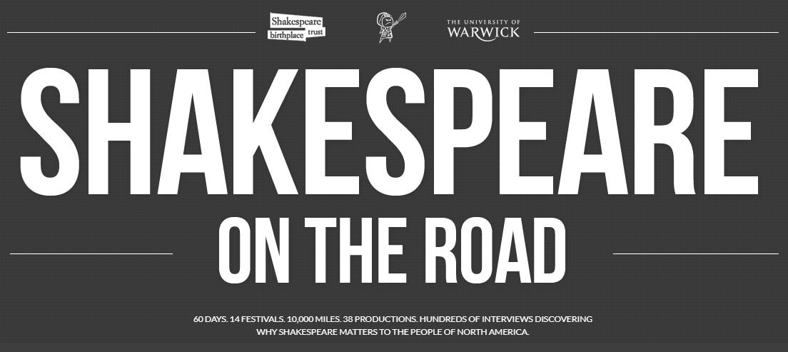 Most of the site—the pictures notwithstanding—is minimalist and monochrome, not too busy, and pleasant to look at.  Directly below the title, you’ll notice a short and pithy description of the site’s purpose and parameters; off to a good start already. For the intended audience of the Shakespeare enthusiasts, the authors have included a map of their road trip from festival to festival. Each festival is marked with a minimalist tent icon that, when clicked, pulls up a small chat bubble containing the festival’s name, location, and a snippet from its mission statement. For example, the Nashville Shakespeare Festival aims to educate and entertain the Mid-South community through Shakespeare performances. I’m convinced most of the site’s speed issues start at this map, which my laptop considers “unsafe scripts” (I’m not qualified to diagnose what that means, but I don’t have a virus yet, so I think I’ll keep viewing). However, the map is one of the most striking features on the home page. It provides a quick look at the path taken by the authors, with aesthetically appealing links to the information gathered there. The map layout features interviews from various North American Shakespeare companies, both recorded and written, and musings direct from the authors as they traveled. It’s a fantastic visual feature for the website that fulfills the informative purpose in a fun, interesting way. Not only can the viewer track the Shakespearean journey, but they can also easily draw associations between a festival and a specific take on a play.
The more in-depth information held in the archive is easily accessible below the map. It expands on the featured segments to include a greater volume of the aforementioned interviews and notes, as well as photos, a “thought for the day,” and a closer look at each festival. Each type of information has its own background picture on the home page, and when you hover over it, a short, descriptive heading pops up. Again, some of the interfacing is wonky, the longer headings get barely cut off at the top, and you have to click at the bottom of the picture to follow the link, making the site a little less user-friendly. An inherent feature of the website genre is being able to take viewers where they want to go, so in that respect, SotR falls short. The authors of this archive are Shakespeare scholars and it shows. No one would embark on a 63-day road trip, hop from production to production and festival to festival, and design a website detailing the experience if they didn’t love the Bard. A lot of love definitely went into this site, manifested in the sheer volume of information contained within. The authors didn’t limit themselves to prose, either; in true Shakespearean fashion, they composed poetic odes to the festivals they visited and dedicated them to the people they met. Doing so adds a special layer to the archive’s presentation. As the site is geared towards Shakespeare enthusiasts, the authors know that adding poetic flair to the content will capture their audience. In terms of what our class can take from SotR when designing our own website, I think the map is best left at home. It causes more problems than it’s worth. In all seriousness, though, I think we could do well to capture the obvious care put into the SotR page. That’s not to say I think everyone should be very passionate about Shakespeare all of a sudden, but everyone has something about this project that they can enjoy and relate to. That genuinity goes a long way with a site’s audience, even if the coding goes a little sideways and it takes us way longer than it should to format an image. Speaking of visuals, sometimes less is more. We don’t want to overwhelm our audience with too many colors and fonts all at once; they won’t be able to spend much time with our site, which is directly antithetical to a website’s purpose. In conclusion, I don’t know much about web design, but I do have sensitive eyes and a lot of love in my heart. Thank you.
Welcome to the blog! Here's my attempt at coding with HTML and CSS, AKA digital literacy assignment one, HTML Quiz.
|
AuthorWrite something about yourself. No need to be fancy, just an overview. Archives
November 2019
Categories |
||||
 RSS Feed
