|
As part of an assignment for digital literacy, I chose to analyze Shakespeare on the Road, an archive designed in collaboration with the University of Warwick and the Shakespeare Birthplace Trust. Essentially, a group of British scholars went on a North American road trip to visit 14 different Shakespeare festivals, chronicle the performances they watched, and discover what Shakespeare meant to North Americans. The website itself runs a bit clunky, at least on my laptop, but the scope of the material included within is astonishing. We open with a title in large, eye-catching letters, proclaiming SHAKESPEARE ON THE ROAD.  Most of the site—the pictures notwithstanding—is minimalist and monochrome, not too busy, and pleasant to look at. 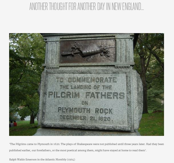 Directly below the title, you’ll notice a short and pithy description of the site’s purpose and parameters; off to a good start already. For the intended audience of the Shakespeare enthusiasts, the authors have included a map of their road trip from festival to festival. Each festival is marked with a minimalist tent icon that, when clicked, pulls up a small chat bubble containing the festival’s name, location, and a snippet from its mission statement. For example, the Nashville Shakespeare Festival aims to educate and entertain the Mid-South community through Shakespeare performances. I’m convinced most of the site’s speed issues start at this map, which my laptop considers “unsafe scripts” (I’m not qualified to diagnose what that means, but I don’t have a virus yet, so I think I’ll keep viewing). However, the map is one of the most striking features on the home page. It provides a quick look at the path taken by the authors, with aesthetically appealing links to the information gathered there. The map layout features interviews from various North American Shakespeare companies, both recorded and written, and musings direct from the authors as they traveled. It’s a fantastic visual feature for the website that fulfills the informative purpose in a fun, interesting way. Not only can the viewer track the Shakespearean journey, but they can also easily draw associations between a festival and a specific take on a play.
The more in-depth information held in the archive is easily accessible below the map. It expands on the featured segments to include a greater volume of the aforementioned interviews and notes, as well as photos, a “thought for the day,” and a closer look at each festival. Each type of information has its own background picture on the home page, and when you hover over it, a short, descriptive heading pops up. Again, some of the interfacing is wonky, the longer headings get barely cut off at the top, and you have to click at the bottom of the picture to follow the link, making the site a little less user-friendly. An inherent feature of the website genre is being able to take viewers where they want to go, so in that respect, SotR falls short. The authors of this archive are Shakespeare scholars and it shows. No one would embark on a 63-day road trip, hop from production to production and festival to festival, and design a website detailing the experience if they didn’t love the Bard. A lot of love definitely went into this site, manifested in the sheer volume of information contained within. The authors didn’t limit themselves to prose, either; in true Shakespearean fashion, they composed poetic odes to the festivals they visited and dedicated them to the people they met. Doing so adds a special layer to the archive’s presentation. As the site is geared towards Shakespeare enthusiasts, the authors know that adding poetic flair to the content will capture their audience. In terms of what our class can take from SotR when designing our own website, I think the map is best left at home. It causes more problems than it’s worth. In all seriousness, though, I think we could do well to capture the obvious care put into the SotR page. That’s not to say I think everyone should be very passionate about Shakespeare all of a sudden, but everyone has something about this project that they can enjoy and relate to. That genuinity goes a long way with a site’s audience, even if the coding goes a little sideways and it takes us way longer than it should to format an image. Speaking of visuals, sometimes less is more. We don’t want to overwhelm our audience with too many colors and fonts all at once; they won’t be able to spend much time with our site, which is directly antithetical to a website’s purpose. In conclusion, I don’t know much about web design, but I do have sensitive eyes and a lot of love in my heart. Thank you.
1 Comment
Cooper
9/16/2019 03:46:06 pm
I agree with keeping our website under control visually. Overuse of visual images and cues can cause distractions to the viewer. I also believe it would be helpful to include information that would be of interest to Shakespeare enthusiasts as well as information that is easy to comprehend for beginners to Shakespeare. Leave a Reply. |
AuthorWrite something about yourself. No need to be fancy, just an overview. Archives
November 2019
Categories |
 RSS Feed
